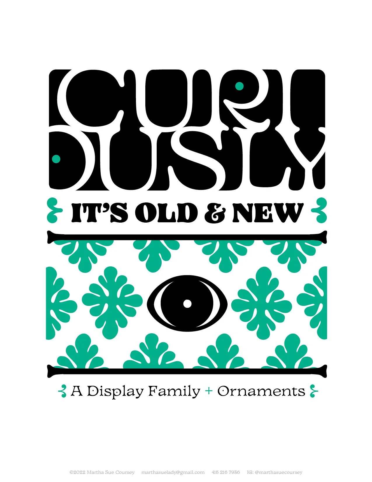
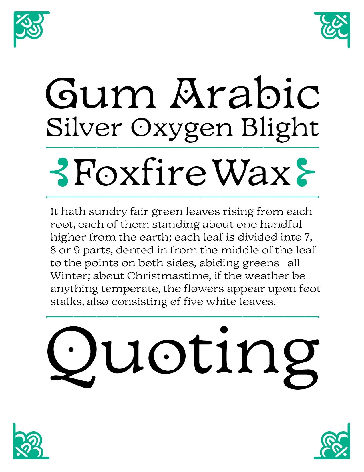
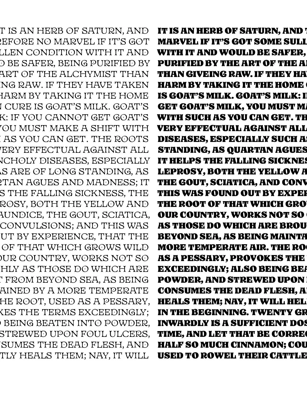
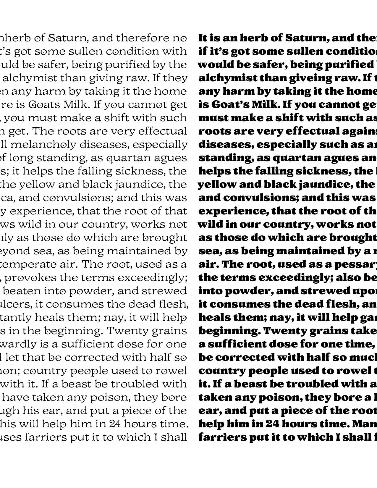
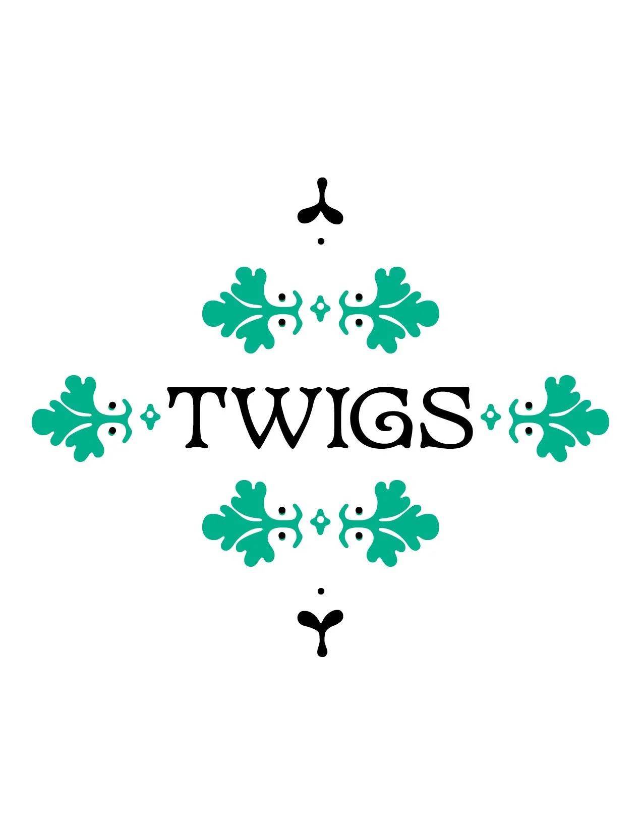
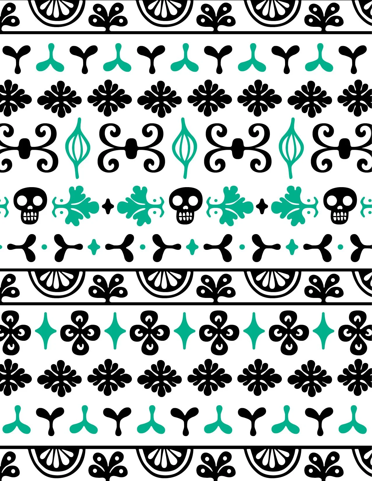
Curiously is an unusual old-style serif display family fueled by my fascination for 15th century Roman letterforms and my childhood experience of beautiful 1970’s-80’s children’s books. The characters are wide, open and high-waisted. Distinctive features include bone-shaped stems and serifs, a diagonal axis, dotted counters and ornaments designed to match and support the typeface.
The rounded stems and serifs, terminals and joints pair well with illustration and reveal hand-made quality when set large. The family also works well for logos, branding, book covers, and editorials but for me the heart of the project is in the way the ornaments relate to the typeface. Available now on Futurefonts.xyz/marthasuecoursey. Download the specimen here.

