For Scott Todnem's “Essential Life Skills for Boys,” my cover design process was a happy mix of lettering, type design, and illustration. The type design and lettering experience ensured consistency in the illustrations, including line weight, scale, and rendering. The illustration background in turn, infused warmth into the letterforms even after vectorization.
What made this project extra fun was the opportunity to handle both the cover and interior work, enabling me to balance the two right from the outset. The big dream is to do type, illustration and cover design for a project. *I would make some elaborate drop caps and typographic ornaments that’s for sure. 🤓
I made a separate page about the interior illustrations here but scroll down to see the step-by-step for this cover design.
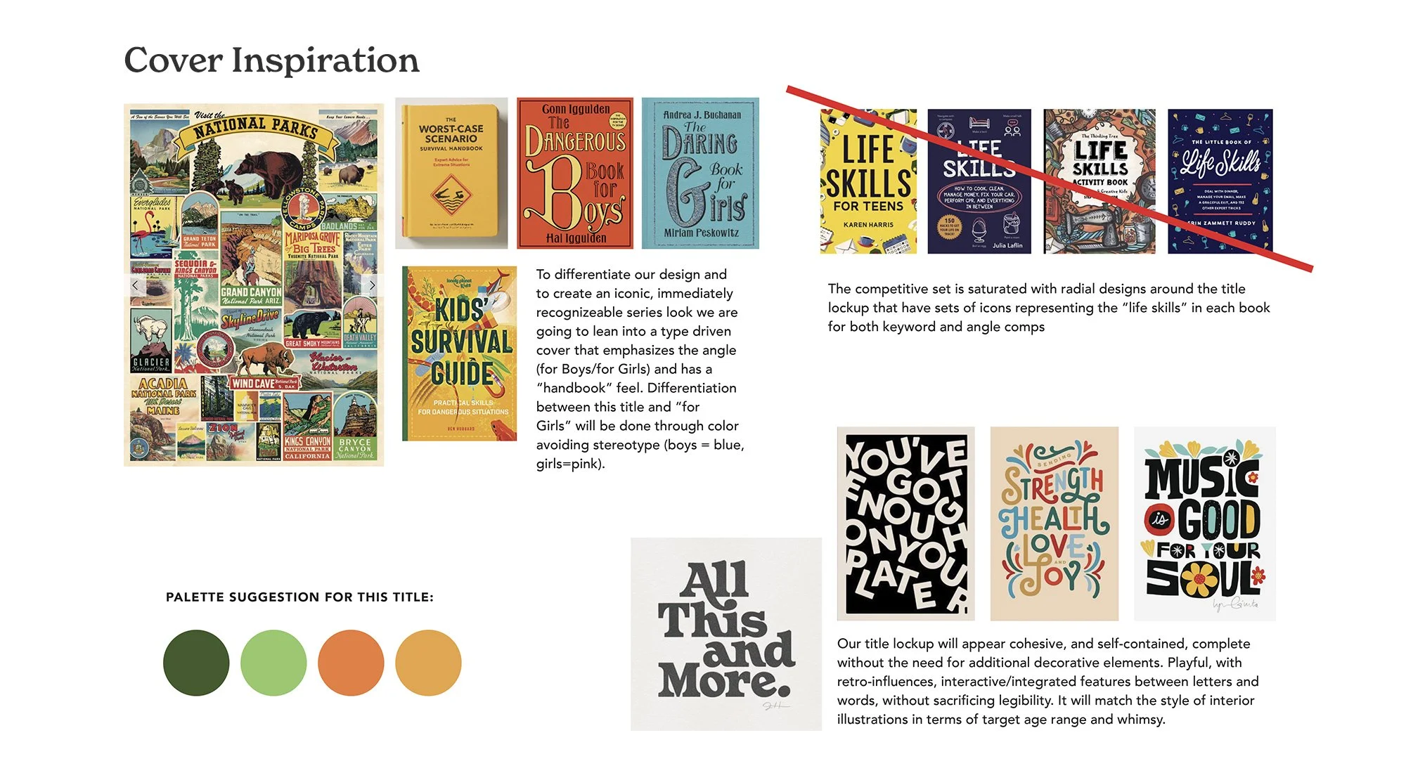
Mood Boards & Client Brief
The initial brief provided inspiration in terms of style and color palette. It recommended taking a type-driven, hand-lettered approach, drawing from vintage handbooks and park posters, as well as considering the competitive landscape. Additionally, the layout needed to be suitable for the next title "Essential Life Skills for Girls."
Style Explorations
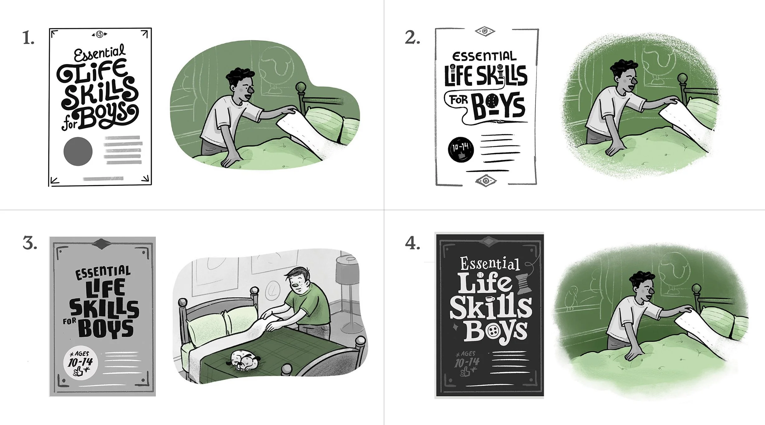
As an initial step in the process, I presented four different pairings of cover and interior concepts, drawing inspiration from my own ideas and the visual references provided in the project brief.
Swashy cover + monoline and solid fill images
Interlocking cover + monoline and ink wash fills
Vintage Boy Scout cover + dry ink and ink wash fills
Windsor/Clarendon-inspired cover + dry ink and watercolor fills
Version 1
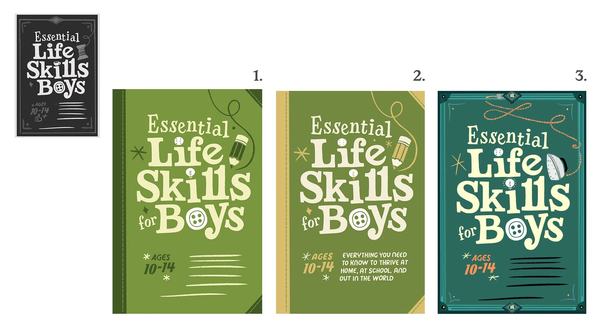
The team liked the lettering and layout style of option four as a starting point. From there I went on to fine-tune the initial sketch and introduced color. Keeping the work in Procreate for this phase allowed me to keep things easy to revise.
Version 2- Just the Lettering
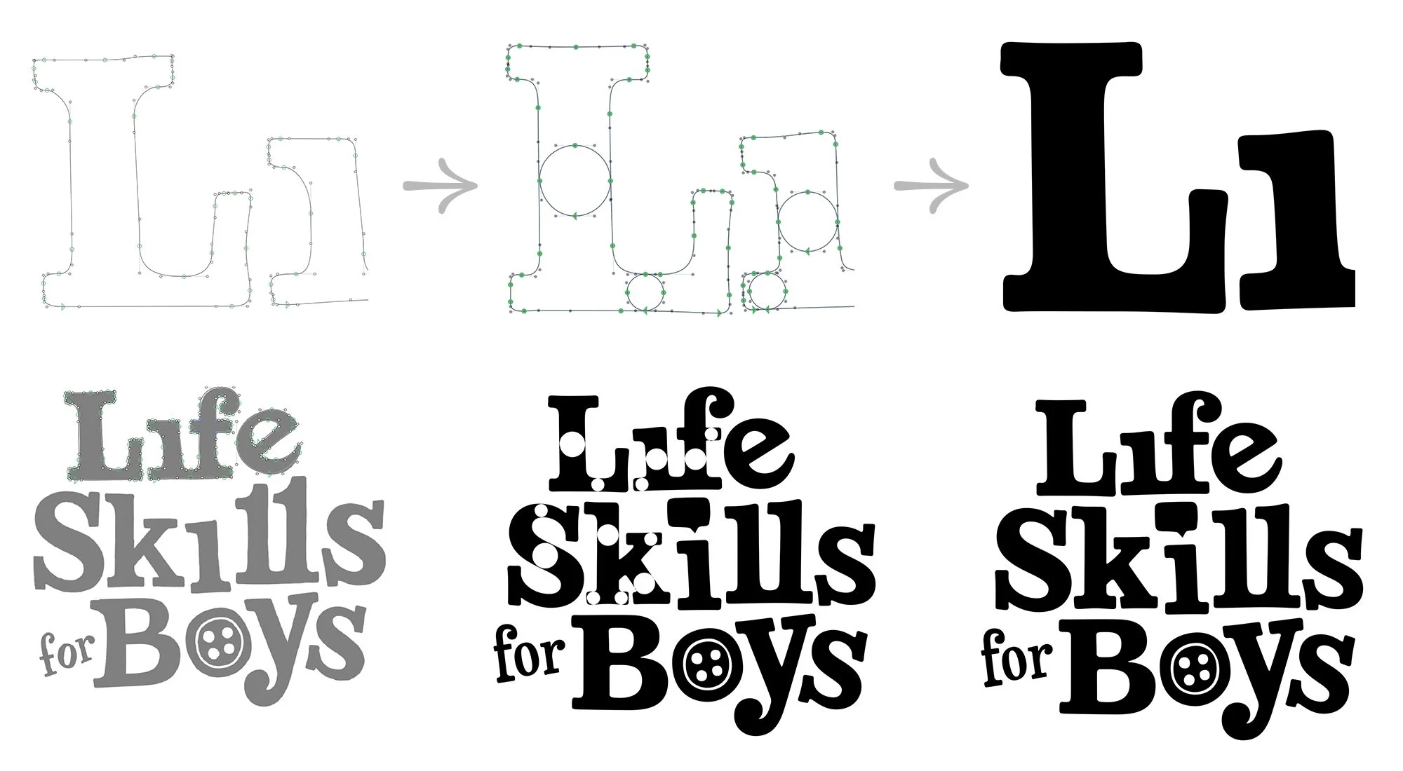
At this stage, I realized that the lettering wouldn't change much, so I proceeded to vectorize. I begin with the procreate sketch and then refine the lettering in Glyphs because its tools are more suitable for this task. (Whenever I start in Illustrator, things end up a bit wonky, and not in a charming way.)
First, I do a rough draft, then I align the vertical and horizontal widths, refine it, and finally move it into Illustrator.
Version 2
We chose a mix of teal and green to add more variety and depth. The sales and marketing team wanted to experiment with different icons, so we replaced the button, baseball, lightbulb, and pencil. I thought about using the swash/vacuum cord to guide the viewer's eye and bring in the dry ink line quality from the interior illustrations. However, these ended up looking a bit too crowded.
Version 3
In the last review, we made a few more updates to the icons, and then I prepared the file for printing.
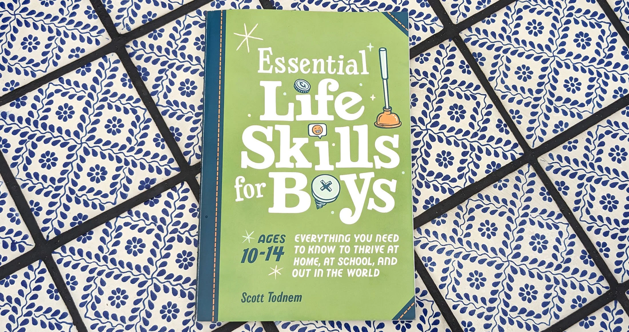
The book designers finalized the Pantone colors, and here is the finished product!

