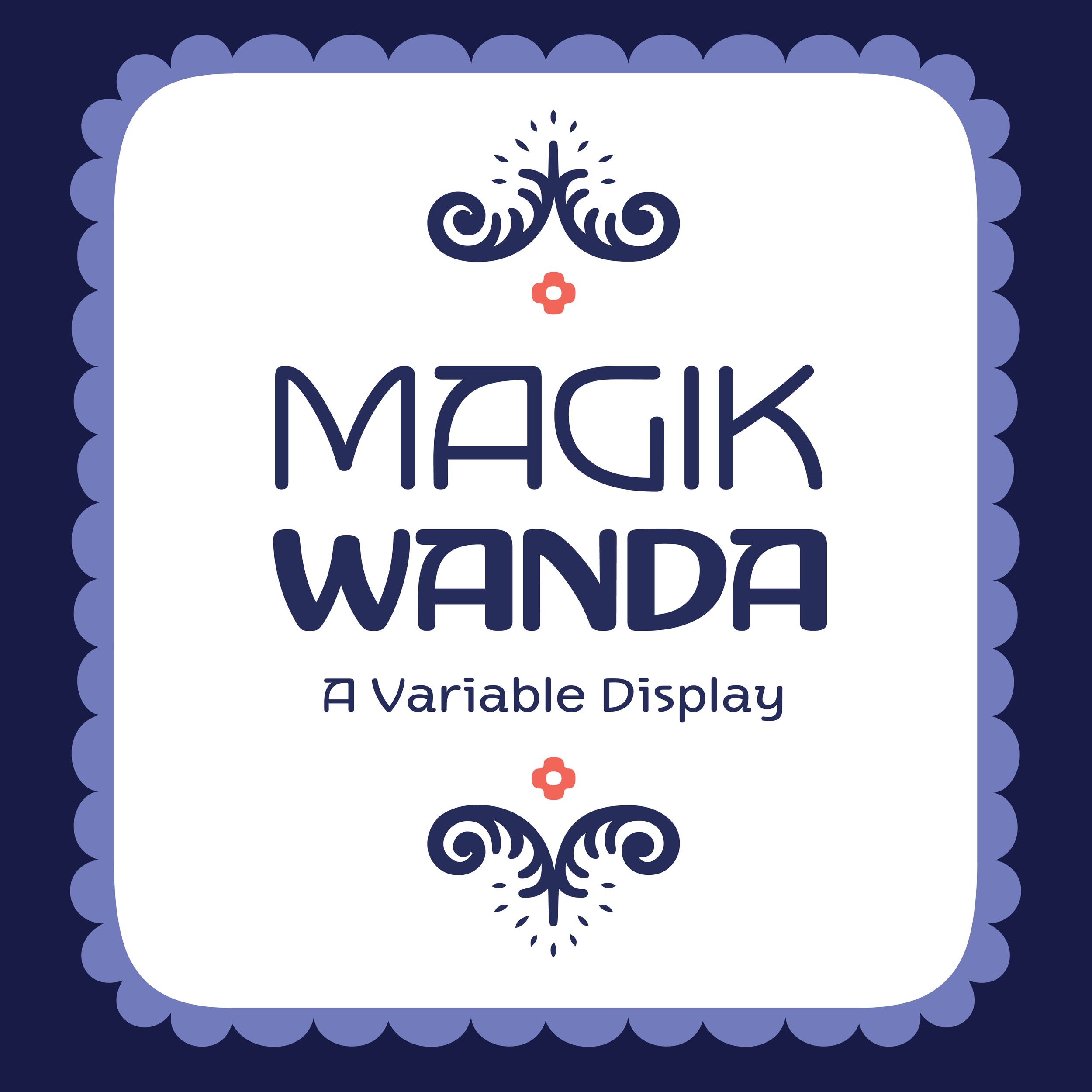
New typeface! Releasing March 3rd on Future Fonts.
Magik Wanda began as inky drawings hand-lettered with a Speedball Series B nib. As it developed, it took influences from the lettering styles of the Vienna Secession movement (especially Berthold Loeffler), the illustration and lettering in Wanda Gag's children's books (cir. 1920), as well as elements of my signature style. The almost monoline light weight stays close to the round pen nib look, while the heavier weights have a high contrast reminiscent of Art Deco type. This makes it fantastic for use in food packaging, beauty products, restaurant branding, cookbooks and publishing.
While primarily for use as a display, the lighter weights can work well for text. Variable axes for width and weight help integrate the ornaments, since they allow for matching line weights at different scales - which I can tell you as an illustrator is handy. The Basic Latin set is ready this release, along with ornaments full of borders, patterns, birds, kittens, food, and flowers just in time for spring and to keep our spirits up.


